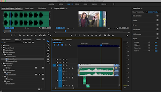
Since I started shooting late, this meant I had less time to edit the film together and it needs a lot of work. Once I'd assembled the rough cut I was able to see issues within the film, firstly the flow. It was boring to watch, I wasn't getting the emotion that I wanted my audience to get. I just felt bored throughout watching the rough cut. But I persisted and started getting up and cleaning the order. I wanted the flow of the film to be steady and calm.
I started editing together the audio once I'd gotten a cut together and added in the voice over. Once this was done I went and started on the Flash back scene. (Scene 4).
I edited this in a separate sequence so that I could find and fix it quicker than looking through an entire timeline. I put all the clips in together as well as the cut at the end of Stacey making the pinwheel spin then just the pin wheel on its own spinning.
How I achieved the effect I was aiming for, was by going onto the effect controls and creating a layer in the opacity option and then masking around it as best as I could, it wasn't 100% perfect when it was finished and it's as good as I can get it myself, but it's giving me the effect that I want and with colour grading I think I can clearly make this a 'flash back'. Audio wasn't any issue here either.
 Once I'd done this I focused on the sound design of the film. Adding in the wild tracks and removing all the un-needed noise that was in a lot of my footage and adding in the finished voice overs. While doing this I was able to see which parts I wanted music for. I wanted a mix of music for this. Since the film starts off sad and rather depressing I knew I'd need classical music with a soft and minor key sound to it. I found some royalty free music online which was perfect, mixing in with something from Bensound.com (also royalty free). But, when it comes to the ending of the film and Stacey's final shot from behind her head to the front, I wanted some very happy and uplifting music.
Something to really bring the mood up and make everyone smile and see the good side of this story. I found a track from a royalty free YouTube channel called "MorningLightMusic" with an uplifting song on there channel. The song is intended for sort of travel videos but when I mixed it into the film it really works, more of a modern take of the music rather than sticking to classical.
One of the issues I had with editing was scene 6. This is where Becky wakes up and we are introduced to her friend Chelsea and we see she's slept in and we get introduced to the character Chelsea. I already had issues filming this, as I couldn't get the lighting that I wanted and the effect which was sun rays through a window. As well as this, I didn't like the pace of the scene and when assembled found this was what was ruining the film for me. It just isn't an engaging scene and isn't very pleasing to watch. Below is the rough cut version of the scene.
There are many things I didn't like about this scene, the cutting just doesn't look very nice, the acting from my actors isn't great and the line "they say sun rays are the sign of a guardian angel" isn't delivered well so we lose that line. I can see this is my fault, during production I should have gone for another take and communicated with my actor Chelsea on this but I was still trying to achieve the lighting I wanted which didn't work out.
I ended up deciding to cut this scene, there were far too many issues and I felt it was bringing down the value of the film and wasn't contributing towards the story in anyway. Thankfully, the following scene outside in the garden works really nicely after the scene with Stacey walking and discovering she's died.
With the final scene, I was originally going to have the final shots as the ribbons seen in all locations, but when I assembled the cut and watched the shot of Stacey (Carly) with the voice over, I felt this worked better. It's a beautiful shot and cutting into it would ruin the delivery of the lines and once we hear the final line it's nice to fade down and end the film.
Grading
Once I'd finished the cut and I was happy with what I had, I went on to start grading. I knew I needed the grade to match the mood of this piece as I'd pitched it in the beginning.
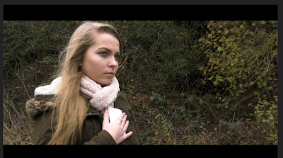
 With the colours up until the final scene where the mood uplifts a bit more, I wanted very greyish and sad colours towards the grade. Adding to the mood. I brought out the contrast and lowered the saturation by 20% to gain this look. Bringing out more detail with the blacks and whites and adjusting the highlights, I was able to get a look I was really happy with. I did have to change this slightly as I needed to bring the detail out more to give it a more crisp and film look.
I used this same grading for all the outdoor scenes apart from the flash back scene, night scene and the final scene. I did it for Stacey's walking sequence as the colours help to set the mood.
With the flash back scene, I wanted to show Becky and Stacey in a happier time. Stacey is alive in this flash back and they're both happy. As well to show that this is indeed a flash back, I brought the colours warmer here. Bringing the exposure up slihgtly and the contrast, I brought the saturation up by 40% so we really get a nice feeling of warmth and love from the characters and the scene overall.
The transition of the flash back, to reality again was difficult. I wanted to use the grade here on the same shot to go back, having that pinwheel as the reference point for the transition. I cut the clip and had the shot where Carly is still there, then it cuts to the pinwheel spinning on it's own. Grading this, I kept the colours warm with Carly still in shot then went back to those cold colours to show the difference and the fact Stacey isn't there anymore. Below are the 2 shots:
To make this transition smoother I added in a cross dissolve, a jump cut just didn't look very nice and since I'm not using any sound to transition the 2 shots across I went with a video transition instead.
With the final scenes, I wanted the grade here to be slightly different. This is where the mood of the entire film lifts, we get much more happiness and comfort from the characters and its the climax of the film. I decided to bring much more worth with the colours using the saturation and brought detail out in the blacks and the whites as well as adding more contrast and kept this for the final 2 scenes.
With the final scenes, I wanted the grade here to be slightly different. This is where the mood of the entire film lifts, we get much more happiness and comfort from the characters and its the climax of the film. I decided to bring much more worth with the colours using the saturation and brought detail out in the blacks and the whites as well as adding more contrast and kept this for the final 2 scenes.
Titles
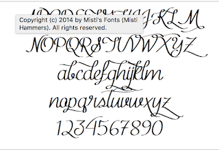
 Final part of the post production was choosing the titles and credits. This was more the font I wanted to use. When I remade Shaun of the Dead for Directions in my first year, I used the original logo and title from the Feature film. I liked the idea of making and branding this film rather than just a boring text saying "Ribbons". So I looked online for a font which looked like a Ribbon. I found the font "MF Kind and Whitty" the font is slightly difficult to read but you can read it so I tried it with the title:
I loved how this looked. Really stands out and gives a sort of brand to the film. As well it fits with the theme of the yellow Ribbons as I added in a black outline and filled the colour as a bright yellow. I did this for all the text in the film to keep the theme consistent.


No comments:
Post a Comment