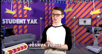
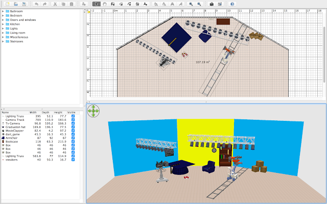
 When it came to designing the background for our 'studio' sections with the Green screen. After having inspiration from Film Riot and one of the UCA Digital News Projects "Student Yak" I contacted Joshua Jones from the 3rd TV Production. I asked him how he created his Studio Background for this unit and he told me that rather than using After Effects, a very complicated piece of Adobe Software. He had used a 3D Model software called 'Sweet Home 3D'.
This software allows you to create a 3D Model of a home (so originally decided for home planning) and then allows you to turn this 3D Model into a picture which you can stick behind and use with Green Screen. Josh told me that the software is free to use and also offered to give me some 3D Models he used in the set for 'Student Yak'.

Josh put a large amount of time into designing his set for Student Yak and really understood the software and how to create his own textures and models. I still found this very complicated and could only do the basics with Sweet Home 3D. So, rather than spending weeks learning the software and trying to decide on what design to go with. I decided to use the branding we had come up with to my advantage. Since our logo and our website was a very simple branding, I chose to keep the studio like this. So, when designing I kept the walls to the basic 2 colours we're using, yellow and blue. I made the set colourful and simple. I lucky, found a large graduation cap 3D Model online and was able to add this in as a sort of table which works really well. The set I made was intended to look a little like a chat show. From the angle we're at in the photo above, it doesn't look that affective. Below is the photo version of the set.
Again, still doesn't look hugely effective. I also added in the light brackets and dart board and clapper on the wall to give it a very student and informal feel. Once I put it into Premiere with the green screen footage...
With a slight blur added, it gives a really good effect and works with our branding as well. Although, a very basic set and I feel I could have done a much better job given I knew and understood the software better. I feel like I've really captured the branding across with this and I think it works really well as our set.


No comments:
Post a Comment